Rice
Designs On— Packaging
Mi is the Chinese character for rice, one of the world’s single most important staple foods. The symmetry and simple structure of this character aligns with its role as the anchor of the Asian diet, feeding the rich and poor alike. The great unifier.
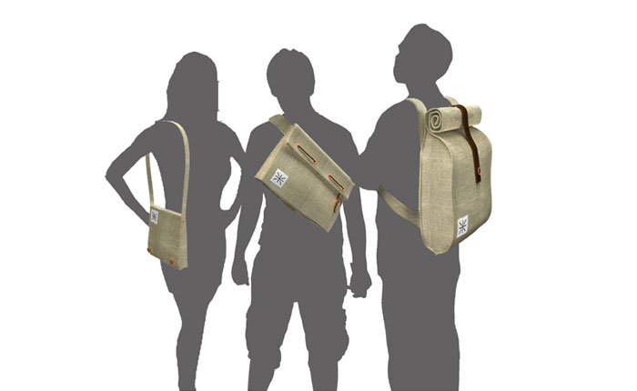
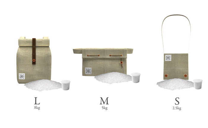
Though rice remains a vital source of nourishment, its packaging looks bland, utilitarian, even coldly industrial. To elevate its role as an everyday hero and push it into modernity, these designs make the grain easier to recognize and carry in urban settings.